Peer Review #1

albumthoughts.com
First off, I want to make it known that I love this website idea. Not just because Noah has an amazing taste in music (I love the albums they have chosen to review) but also because I think there is always a great market for music reviews and specifically album reviews as people are usually apprehensive about listening to a whole album. This is because it is definitely an investment in time, which is something we all don’t have a lot of.
I like that the website is pretty straightforward and clear. There isn’t too much clutter. It’s easy to follow the blog posts and I am quite impressed with the authors choice of their theme. It makes it really easy to navigate. One thing I would recommend is adding a site icon; though I don’t know if we have gotten that far in our website development. (That’s the little favicon at the top of the website.)
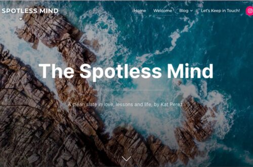
The main home page is quite calm and I like the header image. One thing that I think the author of this page could do better is incorporate more and diverse types of media. When reading any of the reviews I find the pages quite text heavy and a bit plain. The only media on the review pages is just the album artwork for the artist. The author may consider posting links to some of the songs they talk about. I think the website could use some more interactive features. It doesn’t have to be colourful but it definitely needs to have elements that draw a viewers attention and keep them clicking through.
The attention span of most people can be quite short and so I would like to encourage the author to ask themself “what makes their music review blog different from others?”. I think if they can find a niche in the market of album reviews it may make finding an audience a lot easier. Process post #4 talks about what they believe their audience may look like. I don’t think that the author has made it clear who their audience is, they mentioned that they are targeting an audience like themselves “people looking for further exploration and insight into the beautiful art that is music.” I don’t think that this description or idea of “audience” is quite narrowed down or very specific.
Speaking directly to the authors About page, I think that they are doing a disservice by not having any media on this page. Even if the author is not comfortable with posting a personal photo of themselves I think that something to link what we are reading about the author to some sort of visual or even auditory connection would be beneficial. I think that the author posting a photo or video of them playing an instrument would be amazing!
I believe with websites where you are sharing your opinions people may want to engage with you and possibly agree or disagree. I don’t feel like the site at the moment is encouraging discourse or even positive comments from site visitors.
I really enjoy the reviews as I find that they are quite in depth and also well thought of. I like the length of the reviews and I liked at the bottom of the J.Cole review that they posted their personal list of “Best Songs”. I suggest that they include this list on every post because it is a nice and engaging piece to include.
Overall, great site Noah! Keep on rocking on!
You May Also Like